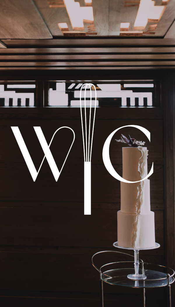
responsive logo
I collaborated closely with Milwaukee cake studio Whisk Chick for a rebrand that conveyed a more modern, elegant style that closely aligns with her cake style.
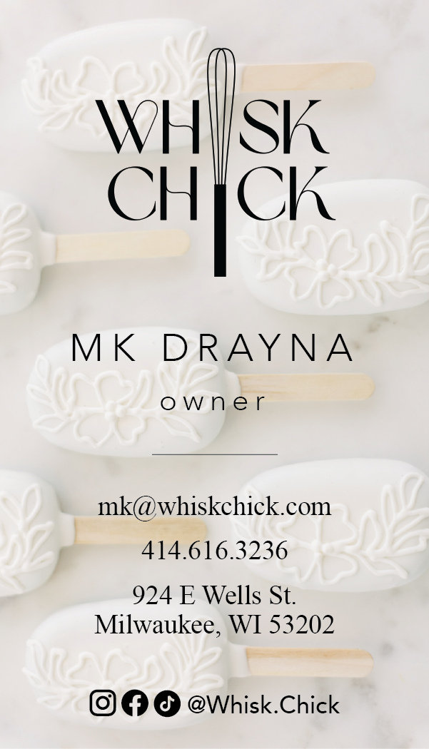
First, to create a new logo, we chose a typeface with a combination of clean straight edges and more fluid, organic lines, which feels current yet classic in its subtly art nouveau-inspired style. We adjusted the weight of the typeface to be more legible, and I then created a minimalist whisk motif to match the weight of the text and placed it in the center of the logo, which, depending on the context, can replace the “I” in both words or just establish a balanced divide between them, which creates a symmetry that also contributes to the timeless feel.
First, to create a new logo, we chose a typeface with a combination of clean straight edges and more fluid, organic lines, which feels current yet classic in its subtly art nouveau-inspired style. We adjusted the weight of the typeface to be more legible, and I then created a minimalist whisk motif to match the weight of the text and placed it in the center of the logo, which, depending on the context, can replace the “I” in both words or just establish a balanced divide between them, which creates a symmetry that also contributes to the timeless feel.
|
|
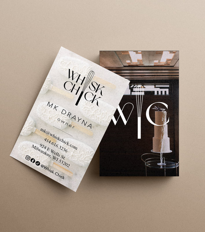
business card, both sides
|
She also wanted to keep with a neutral, high-contrast color palette, so we chose photos of her work in tones of black, dark brown, cream, and white to use as backdrops for her business card and menu, adjusting the color-grading to maintain clear contrast with the overlayed text. The rest of the design was kept quite minimal to balance the striking photos.
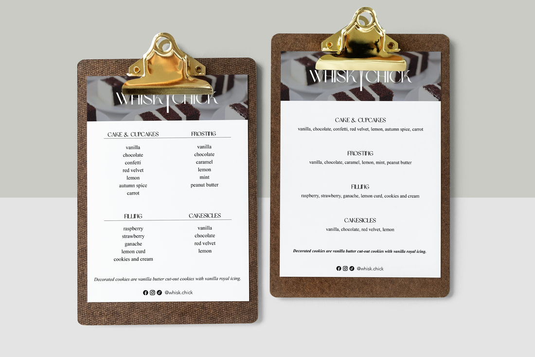
menu, two options
|
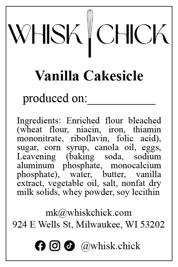
product label
|
I also created a wholesale product label, which included key branding elements in the typeface and logo, but was otherwise kept extremely minimal to be as legible as possible, as this label is primarily for food safety.
